To wrap up this series of blog posts, we’re going to get a little bit deeper into the business of setting operating thresholds. The technical details of applying an operating threshold are fairly simple: you choose a class and a threshold, use BigML to make a prediction for some instance, and apply the class if the prediction’s probability is over that threshold. As we’ve seen, this is easy to do via the Dashboard, the API, and with WhizzML and the Python Bindings.
What’s a little more tricky to pin down technically is how you set this threshold for your particular data. One of the dirty little secrets of Machine Learning is that this almost always needs to be done, and Machine Learning can’t do it automatically. This is because the algorithm can’t know from your data alone which sort of mistakes are tolerable and which are unacceptable. It needs your help!
Thankfully, we’ve developed a tool that takes a lot of the pain out of discovering where the best threshold is. When you create a BigML evaluation, the information you need to set for this threshold is at your fingertips. Let’s dive in.
Splash
As we mentioned in a previous post, you create a BigML evaluation by first creating a training and test split, then training a model on the former, and evaluating it on the latter. By default, the evaluation view is a collection of numbers that summarize the performance of your model with the default threshold.
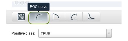
However, if you click on the ROC curve button at the top, you see the ROC curve, a selector for the positive class, and a slider to select the probability threshold. You also see a whole bunch of numbers next to the curve, which we won’t go into here and for the purposes of threshold-setting usually aren’t necessary. Our business here is mostly with the curve and slider.
The curve you’re seeing is the ROC curve (Receiver Operating Characteristic) of this model’s predictions with regard to a particular class (which you can set in the “positive class” dropdown above the curve). On the y-axis is the true positive rate and x-axis is the false positive rate. Each point on the curve represents a threshold, with its own true positive rate and false positive rate. At high thresholds, both numbers will be lower (you’re labeling less examples positively because you’re setting the probability bar high). As you lower the threshold, your true positive rate will go up, as you pick up more of the positive examples (good!), but so too will the false positive rate (bad!). The threshold setting game is to pick up as many true positives as you can while only picking up as many false positives as you can tolerate.
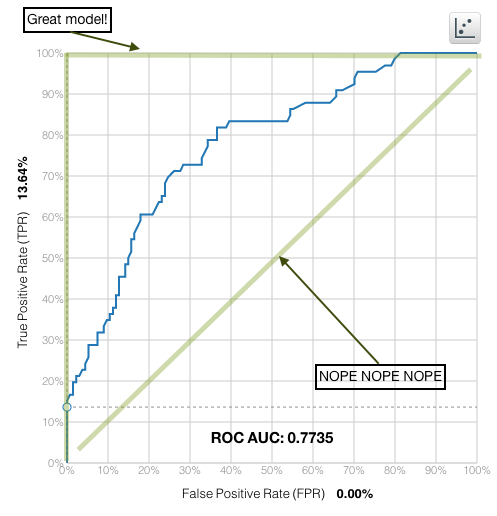
As a modeler, what you’d like is for this curve to go up as fast as possible on the left side of the plot (indicating that the examples labeled with the highest probability for that class actually are examples of that class), then flatten out as you move right. The best possible model will have a curve that is a right angle at the upper left of the plot, and a model that’s no better than random will be a diagonal line through the center of the plot. The closer you get to that right angle, the better of a model you have.
Is it safe?
One nice thing you can see from a curve like this is how reliable threshold-setting will be for this model. Because the data you apply the model to will be slightly different from your test data, your chances of not getting exactly the performance you see for some threshold are pretty high.
If the curve is fairly smooth, like the one above, this isn’t a big problem: it means the performance of one threshold is much like the performance of another. If it isn’t, it means that adjacent thresholds appear to have radically different performances, and so your performance in the “real-world” might not even be close to the performance you see in the confusion matrix for the given threshold.
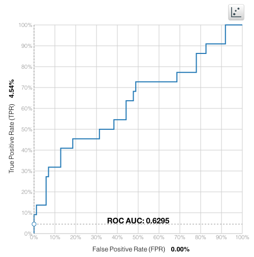
What do you do if you see this sort of curve? This basically indicates that you need more data. My own experience is that you’d prefer to have at least a few hundred instances in your evaluation dataset to conduct an accurate evaluation, and anything less than a hundred starts to be a bit scary from an evaluation-certainty perspective.
The Devil and the Deep Blue Sea
We’ve gone through a few threshold setting use cases in previous posts, and the way you set the threshold typically involves sliding around the threshold slider until you see a confusion matrix that you like. This is a good way to do it, but it typically involves having both a very good idea of exactly the costs of mistakes in your domain, as well as potentially looking at every threshold. Are there some rules of thumb in cases where you lack this certainty or patience? Thankfully, there are a few things you can try right off the bat:
First, look at the confusion matrix for the default threshold of 50%. If it’s satisfying, you don’t have to do anything, which is always best.
Next, on the slider, you will see a vertical mark labeled “Max. phi”.

This is the threshold that maximizes the phi coefficient for this class. Phi is a measure that accounts for class imbalance in the results, so if your positive class is rare but important to get right (think: medical diagnosis), then this might be a better choice. Try sliding the threshold selector over the vertical line and see if your confusion matrix is more to your liking.
Click on the plot for the K-S statistic:
This is another way of showing, as you lower the threshold, how fast you pick up the positive versus the negative examples (the former is the blue curve and the latter is the black curve). You’d like a threshold where the distances between the curves are as large as possible, indicating that you’ve picked up a high percentage of the positive examples and a low percentage of the negative ones. We’ve drawn a dotted line on the plot where this distance is largest.

Move the slider until your threshold matches that dotted line and check out the confusion matrix at that point to see if it’s better suited to your context.
Wait! There is . . . More?
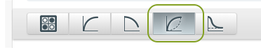
Oh, you didn’t know about the other curves? For experts and intrepid beginners, we also plot the precision-recall and lift curves, which give you still more information about your model’s performance. You can read more about these other curves on THE INTERNETS, or in our own documentation.
Want to know more about operating thresholds?
If you have any questions or you’d like to learn more about how operating thresholds work, please visit the dedicated release page. It includes a series of six blog posts about operating thresholds, the BigML Dashboard and API documentation, the webinar slideshow as well as the full webinar recording.
