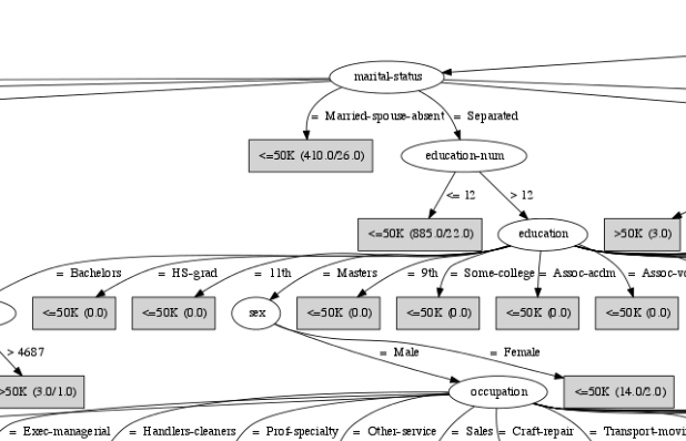
Decision trees are a very straightforward machine learning model, and visualizing generic tree structures is a fairly well established technique. However, decision trees can become very large, limiting the usefulness of simple techniques. Typical visualization environments, like Weka‘s default implementation of GraphViz, can generate tree sizes that make them difficult to render, navigate, or interpret.
Tree Huggers?
At BigML, we have given decision trees some love, and have made visualization a first-class citizen of our model analysis workflow. Here are some highlights of our visualization features:
#1 Prune and Squeeze
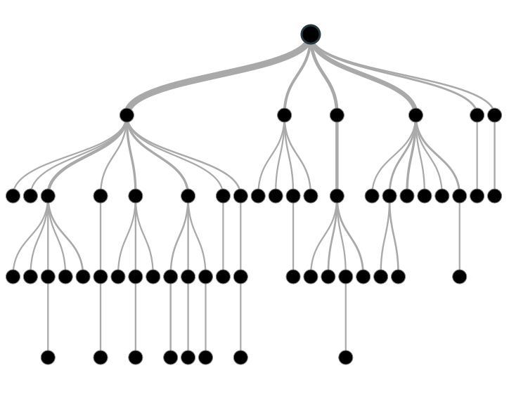
The decision tree visualization layout uses an algorithm that generates a compact representation of the tree, based on work by Reingold, Tilford, and Buchheim.
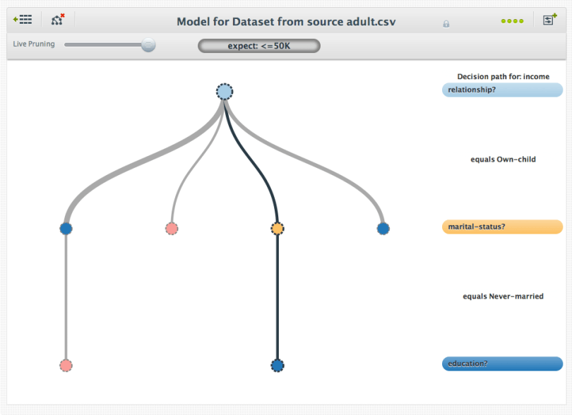
This layout is very good at preventing the tree from becoming too wide, while enabling each branch (or “node”) to be clearly displayed. However, even with a compact layout, the tree is still too wide to be displayed on a normal browser. Therefore, we only show parts of the tree that have at least 1% coverage (we allow you to see more/less branches and browse interactively, more on that later). Since many branches of the tree only see a small portion of the training data, they are often not as relevant or reliable for the model. We’ve encoded this data coverage ratio as the width of each branch line, so you can quickly see which parts of the tree cover larger parts of the training data. Accordingly, the lines at the top of the tree tend to be wider than the ones at the bottom.
#2 Paint and Label
The tree structure itself is not enough to really know anything useful about the model. Useful information might include what field/information a given branch is using to make a branching decision. It’s also useful to know the decisions that led to a given predicition. A common visualization approach (like the Weka example shown earlier) is to display this information within the tree. This has several drawbacks, including causing problems for legibility, overflow issues, and general information overload problems.
Rather than embed the information in the visualization itself, we chose to put relevant model information along the side of the model.
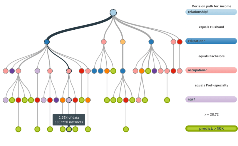
The tree now has colors that represent the different fields that the branch uses. The color of the field on the right will match the color of the currently highlighted path. This makes it easy to identify important fields that commonly occur all throughout the tree. We use green BigML logo colors for the “prediction” nodes.
Whenever you highlight a path in the tree (shown by a thicker, darker line), the corresponding path information shows up on the right hand side. For instance, this given model evaluates census information on individuals. The first thing it looks at is relationship status. In the current branch, this equals “Husband”. Next, it will evaluate education, occupation, and age. Reading from top to bottom, it’s easy to see the chain of questions and answers the decision tree used to come to a given prediction (in this case, predicting whether they make more than $50 thousand dollars a year). A smaller popup tells you the data coverage for the given node, in terms of a percentage or a count.
This approach allows the user to clearly see the structural form of the tree separately from the textual information from the fields. Since the textual information is all in one column, it is easier to understand an entire prediction path expressed as a simple series of questions and answers.
#3 Slide, Point, and Click
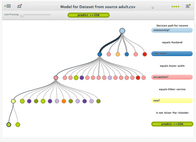
The decision tree layout function uses a pruning method by default that can hide certain branches. Whenever a branch is hidden, the parent branch will have a broken outline, indicating that it contains one or more hidden children. Clicking on the parent node will show all of the child nodes that it contains in a fluid animation.
In this fashion, it’s easy to visit any of the branches with low data coverage that are hidden by the pruning method.
The pruning method itself (called “live pruning”) lets you change the data coverage pruning with a great deal of granularity, and instantly see the new visual representation. You do so by sliding the “live pruning” control on the model control bar to the left or right.
In this fashion, it’s easy to “tune” a decision tree to show nodes that have a higher minimum threshold for data coverage.
#4 Live Updates
Our decision tree training algorithms work on any size of data. However, model training for large datasets is not instantaneous. Therefore, our decision tree visualization screen share updates itself periodically to show the current state of the partially trained decision tree. This method is useful to get immediate feedback on how the model is interpreting the data, allowing our users the ability to cancel an incorrectly specified model before it finishes, rather than waiting.
Want to See it in Action?
Register for a BigML account, and get ready for to look at decision trees in a whole new light. Do you have experience with decision trees? Love them, hate them, or maybe just curious? Leave a comment below.

From what i understand the main reason for using decision tree is not for their predictive power but instead when trying to extract pattern.
For exemple if you try to predict how much a customer is willing to pay for your product:
Then what you really want to know is which field have the biggest influence on the prediction and if they effect it negatively or positively.
In that case what i would find more useful then a decision tree is something like this:
– “client that live in Boston have a probability of 80% to be willing to pay more then people that dont live in boston”
– “client that live in boston have a probability of 85% to be willing to pay between 40$ and 80$ ”
Do you think it’s something that can be automatically extracted.
Unfortunately, decision trees can’t tell us about the class distribution of an arbitrary variable. This is a side effect of the way decision trees learn. The trade off is that you get more information about subsets of the data that are important.
To use your example, the probability of a person buying your product may be the same whether or not they are from Boston, but the probability of, say, college students in Boston buying your product may be much higher. Decision trees are built to identify these subsets that have very different probabilities from the overall data, and our visualizations are built to highlight the largest of these subsets.
I understand that for a leaf node you will have more then one variable and this is much more useful.
Ex: relationship = husband and Education = bachelors and occupation = prof-specialty and age >= 28.72 is predicted as “more than $50 thousand dollars a year”
But i guess some of the training example falling under that path of the tree would be “less than $50 thousand dollars a year”. So when talking to the business people i would find very useful to be able to tell them 90% of the people falling in that branch earn more then $50 thousand dollars a year and 10% earn less. Basically how much i am confident in that prediction.
For now, it’s possible to simply evaluate performance by evaluating a hold-out set of relevant data that was never used to train the model.
We are planning on adding additional “confidence” information to the nodes, but the different metrics that are appropriate are also easy to misunderstand. We’re discussing different ways of expressing a measure of confidence in the branch, but it goes beyond simple accuracy. Not all wrong predictions are equally false or bad in many cases. For instance, the cost of making a false positive decision might outweigh the cost of making a false negative decision by a huge factor. This is a crucial part of the value proposition of machine learning, so we want to make sure that we deliver the most useful form of assessment for a given situation.
I completely agree with you that false positive and false negative should have a different cost.
I look forward to see the solution you will come up with.
Congratulation for the good work you have done so far.