This is the third post in the series that covers BigML’s Logistic Regression implementation, which gives you another method to solve classification problems, i.e., predicting a categorical value such as “churn / not churn”, “fraud / not fraud”, “high/medium/low” risk, etc. As usual, BigML brings this new algorithm with powerful visualizations to effectively analyze the key insights from your model results. This post demonstrates this popular classification technique via a use case that predicts the housing rental prices based on a simplified version of this Airbnb public dataset.
The Data
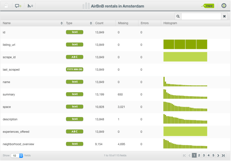
The dataset contains information about more than 13,000 different accommodations in Amsterdam and includes variables like room type, description, neighborhood, latitude, longitude, minimum stays, number of reviews, availability, and price.
By definition, Logistic Regression only accepts numeric fields as inputs, but BigML applies a set of automatic transformations to support all field types so you don’t have to waste precious time encoding your categorical and text data yourself.
Since the price is a numeric field, and Logistic Regression only works for classification problems, we discretize the target variable into two main categories: cheap prices (< €100 per night) and expensive prices (>= €100 per night).
Finally, we perform some feature engineering like calculating the distance from downtown using the latitude and longitude data in 1-click thanks to a WhizzML script that will be published soon in the BigML Gallery. Incredibly easy!
Let’s dive in!
The Logistic Regression
Creating a Logistic Regression is very easy, especially when using the 1-click Logistic Regression option. (Alternatively, you may prefer the configuration option to tune various model parameters.) After a short wait…voilá! The model has been created, and now you can visually inspect the results with both a two-fold chart (1D and 2D) and the coefficients table.
The Chart
The Logistic Regression chart allows you to visually interpret the influence of one or more fields on your predictions. Let’s see some examples.
In the image below, we selected the distance (in meters) from downtown for the x-axis. As you may expect, the probability of an accommodation to be cheap (blue line) increases as the distance increase, while the probability of being expensive (orange line) decreases. At some point (around 8 kilometers) the slope softens and the probabilities tend to be constant.

Following the same example, you can also see the combined influence of other field values by using the input fields form to the right. See in the images below, the impact of the room type on the correlation between distance and price. When “Shared room” is selected and the accommodation is 3 kilometers far from downtown, there is a 75% probability for the cheap class. However, if we select “Entire home/apt”, given the same distance, there is a 83% probability of finding an expensive rental.


The combined impact of two fields on predictions can be better visualized in the 2D chart. by clicking in the green switch at the top. A heat map chart containing the class probabilities is appears, and you can select the input fields for both axes. The image below shows the great difference in cheap and expensive price probabilities depending on the neighborhood, while the feature minimum nights in the x-axis seems to have less influence on the price.
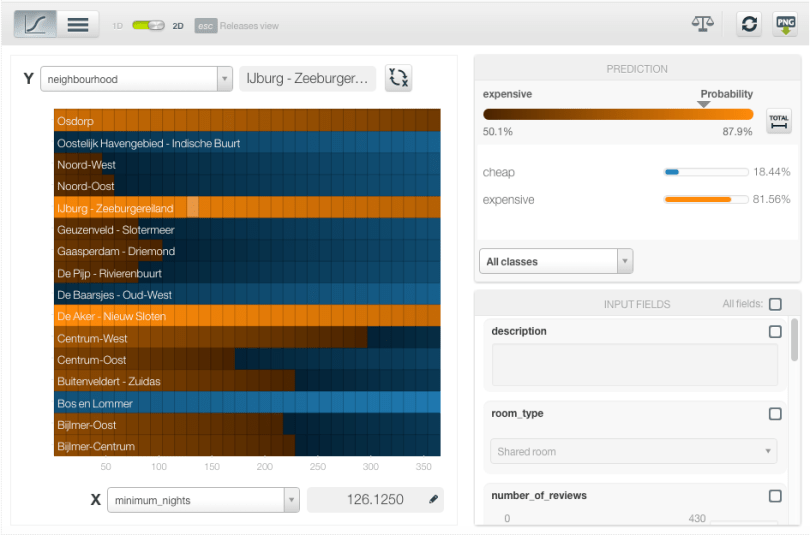
You can also enter text and item values into the corresponding form fields on the right. Keeping the same input fields in the axis, see below the increase of the expensive class probability across all neighborhoods due to the presence of the word “houseboat” in the accommodation description.

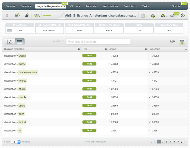
The Coefficients Table
For more advanced users, BigML also displays a table where you can inspect all the coefficients for each of the input fields (rows) and each of the objective field classes (columns).
The coefficients can be interpreted in two ways:
- Correlation direction: given an objective field class, a positive coefficient for a field indicates that higher values for that field will increase the probability of the class. By contrast, negative coefficients indicate a negative correlation between the field and the class probability.
- Impact on predictions: higher coefficient values for a field results in a greater impact on predictions of that field.
In the example below, you can see the coefficient for the room type “Entire home/apt” is positive for the expensive class and negative for the cheap class, indicating the same behavior that we saw at the beginning of this post in the 1D chart.
Predictions
After evaluating your model, when you finally are satisfied with it, you can go ahead and start making predictions. BigML offers predictions for a single instance or multiple instances (in batch).
In the example below, we are making a prediction for a new single instance: a private room located in Westerpark, with the word “studio” in the description and a minimum stay of 2 nights. The class predicted is cheap with a probability of 95.22% while the probability of being an expensive rental is just 4.78%.

We encourage you to check out the other posts in this series: the first post was about the basic concepts of Logistic Regression, the second post covered the six necessary steps to get started with Logistic Regression, this third post explains how to predict with BigML’s Logistic Regressions, the fourth and fifth posts will cover how to create a Logistic Regression with the BigML API and with WhizzML respectively, and finally, the sixth post will dive into the differences between Logistic Regression and Decision Trees. You can find all these posts in our release page, as well as more documentation on how to use Logistic Regression with the BigML Dashboard, the BigML API, and the complete webinar and its slideshow about Logistic Regression.
