In this blog post, the second one in our six post series on Time Series, we will bring the power of Time Series to a specific example. As we have previously posted, a BigML Time Series is a sequence of time-ordered data that has been processed by using exponential smoothing. This includes three smoothing filters to dampen high-frequency noise to reveal the underlying trend of the data. With BigML’s simple and beautiful Dashboard visualizations, we’ll investigate the number of houses sold in the United States.
The Data
We will be examining the number of houses sold (in millions) in the United States by month and year from January 1963 to December 2016.
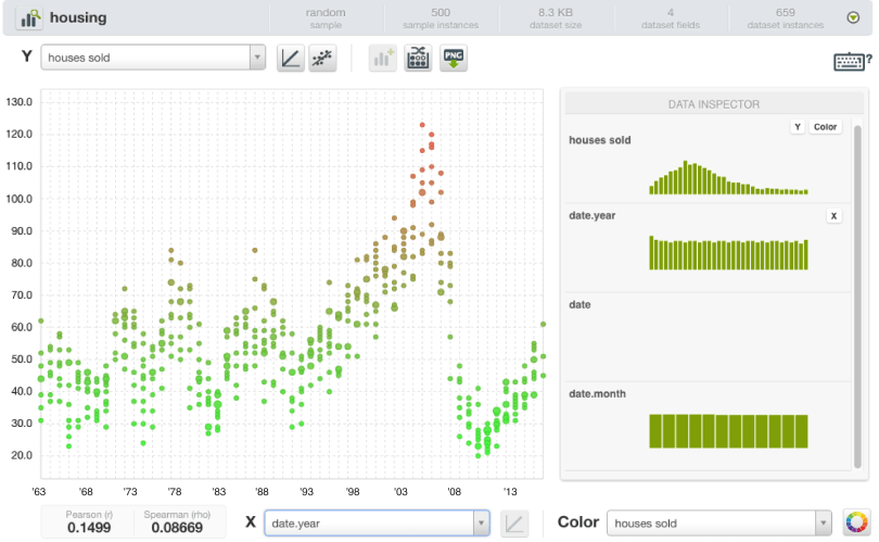
Just looking at a scatterplot of the data, we see the number of houses sold goes generally up and down until early 1991, after which the trend is mostly upward. It reaches a peak in early 2005, then goes generally downward again until 2011, when it once more begins to climb. Within each of these years, there is a noticeable seasonal trend, with more houses sold in the summer months and fewer in the winter. But these are all subjective impressions. Can we create a quantifiable model to predict house volume?
The Chart
First, let’s create a Time Series model from the 1-click action menu by using our raw dataset.
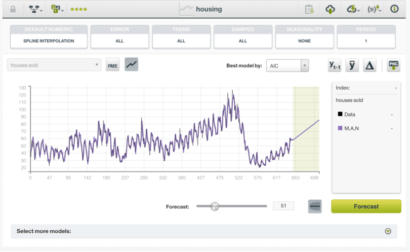
We can see in the chart that our Time Series data is represented by the black line and the plot of our best fit model is represented by the purple line. The model with the lowest AIC (one measure of fit) is labeled “M,A,N”. By clicking on the Select more models: dropdown, we can see this means this model is using Holt’s linear method with multiplicative errors, additive trend and no seasonality. If we wished, we could select some other model, perhaps optimizing for some other measure of fit.
By sliding the Forecast slider, we can see what the model predicts for dates in the future. This model predicts that the volume of houses sold will continue rise linearly. Because this model does not use seasonality, it doesn’t display the up and down pattern we would expect it to. Let’s create another Time Series, this time configuring the parameters so we can add seasonality.
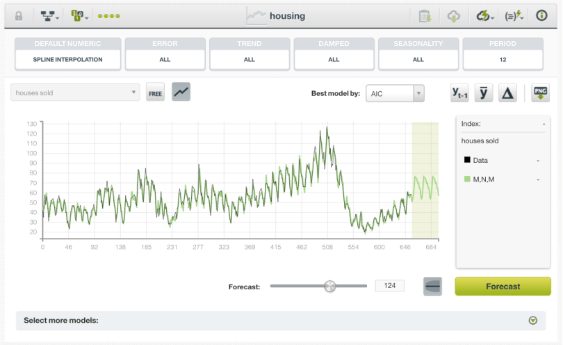
This time the model with the lowest AIC is labeled “M,N,M” for multiplicative error, no trend, and multiplicative seasonality. It captures the ebb and flow of the seasonal sales, but no longer indicates that volume will continue to go up. Since 1963, housing volume has indeed been overall relatively flat.
Another Look at the Data
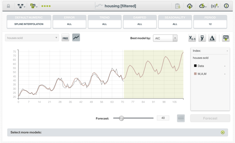
Perhaps we aren’t interested in what behavior housing volume has shown since 1963, but rather what it has been doing recently. We may use our domain knowledge to reason that the housing bubble and following crash was a very unusual event justifying our decision to focus on data from 2011 onwards. How has housing sales volume been changing during these years?
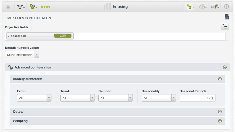
So we start by filtering our data to only include the months between January 2011 and December 2016. We want to capture seasonality, so we choose Configure Time Series from the configuration menu and on the advanced options, set Seasonality to All and Seasonal Periods to 12 (twelve months in a year). Now we can see both the upward trend and cyclic seasonality that we expect. One interesting and unexpected thing our model has discovered is that the cyclic trend is not completely smooth. It seems that there is a little uptick in housing volume in October of each year. Perhaps this can be explained by people wanting to buy before the busy holiday season!
This has been our second blog post on the new Time Series resource. We’ve quickly put Time Series through its paces and used it to better understand sequential trends in our data. Please join us again next time for the third blog post in this series, which will cover a detailed Dashboard tutorial for Time Series.
Want to know more about Time Series?
Please visit the dedicated release page for further learning. It includes a series of six blog posts about Time Series, the BigML Dashboard and API documentation, the webinar slideshow as well as the full webinar recording.

Where is the dataset and bigML’s model performance viewable/downloadable?
The data is from the US Census Bureau: https://www.census.gov/construction/nrs/historical_data/index.html. The actual time series was created on our development server, but here is a public recreation of the dataset (https://bigml.com/shared/dataset/qAbGH3YB1juJqSIfdzm8SwP17yZ). Time series resources are not currently shareable, I will update with links when they are.