We’ve all heard about case interview questions where the victim (sorry, applicant) is asked to explain why manhole covers are round, or estimate how many piano tuning experts there are in the world. Well, here’s a new one for you: How many incidents of graffiti have been logged in San Francisco since July 2008? The answer: more than 162,000. That’s almost 80 incidents per day for more than 5 years, and those are just the ones that got called in to 311; presumably a great deal of street art went unappreciated.
Thankfully, the City has painstakingly recorded a wealth of detail for each graffito, including whether it is “offensive” or “not offensive”. Interestingly, about 61% of incidents are deemed “not offensive”, although this is the home of the Folsom Street Fair (NSFW) so we assume folks grade on a curve.
As a bonus, the data is already geocoded, so we can easily train a model to find parts of the city likely to have (un)offensive graffiti. The result is here, with 56% of offensive graffiti contained in only 27% of the dataset, a rectangle that stretches from the south end of Market Street to Ocean Beach (to the west) and the Marina (to the north). Within this rectangle, public property is defaced by offensive orange dots while private property is, er, enhanced with relatively unoffensive blue dots. (Click the map to see the full Tableau goodness.)
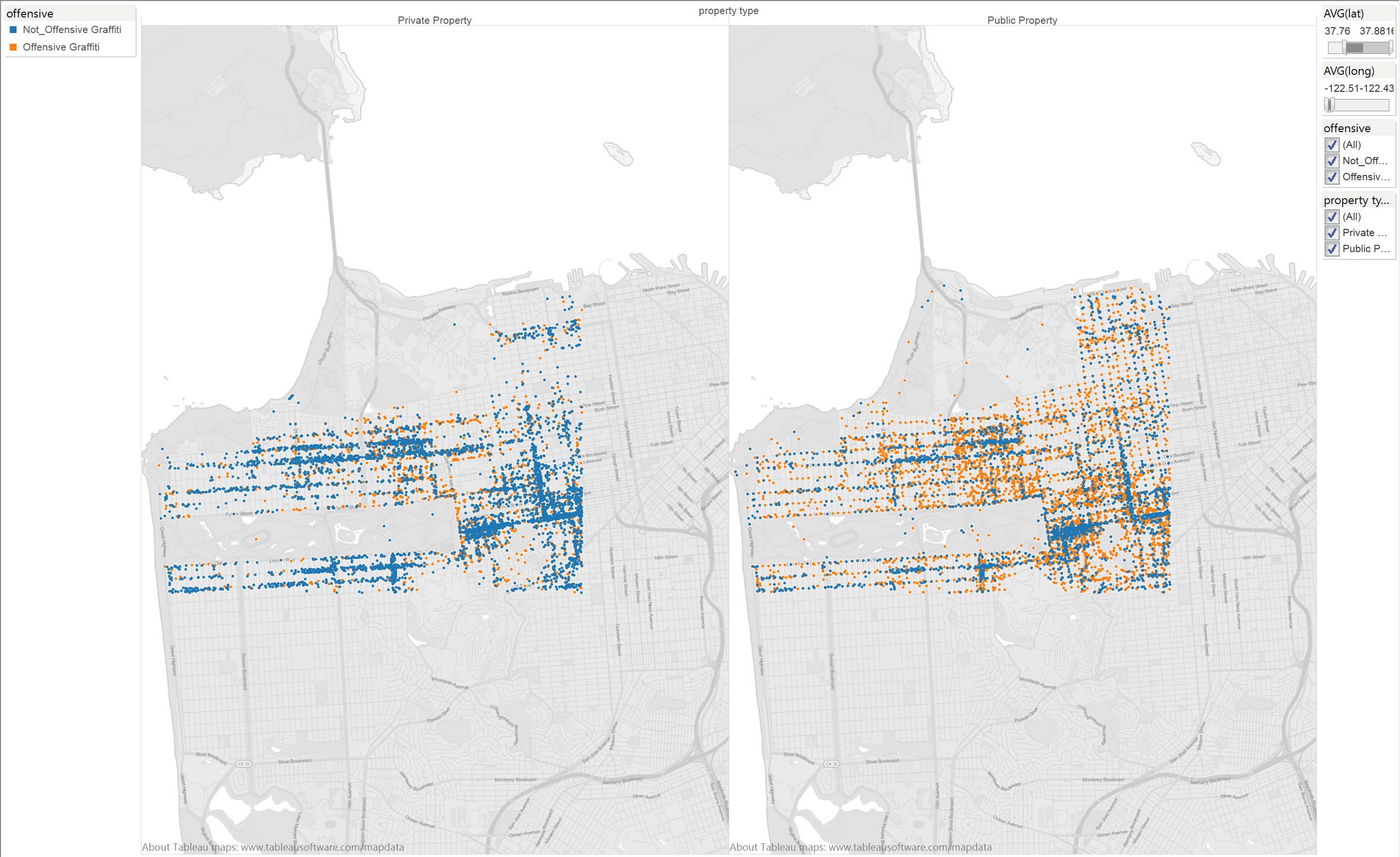
I’m still pondering why this particular rectangle, and specifically the public property within this rectangle, is such a magnet for offensive graffiti. Is public property just more vulnerable to the orange stuff? But then why didn’t the model find a heavy mix of orange around Van Ness and Civic Center (never mind the Tenderloin)? Is this rectangle more sparsely populated than downtown, making people more likely to indulge in the extra-bad behavior of writing not just graffiti, but offensive graffiti? I don’t like either of these explanations; perhaps San Francisco 311 has some insight.
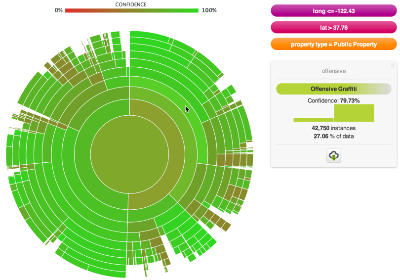
What I do know is that the SunBurst is full of green, which always makes me happy, and evaluation on a single holdout set shows more than 80% accuracy, which is much better than guessing. The confusion matrix tells us that the model’s main weakness is false negatives, i.e. offensive graffiti mislabeled as not offensive.
This is another great example of combining BigML and Tableau to create a compelling visualization: BigML finds a geographic pattern simply by analyzing latitude and longitude as numbers, and Tableau displays this pattern using its (really cool) built-in maps. And in typical Tableau fashion, the finding just leaps off the page.

Hi David, thank you so much for sharing. I tried to learn/understand on data used for analytics and could not find it. Would it be possible to post small sample of dataset to give us a persepctive.
Thanks a lot for your help.