We have recently announced our Dynamic Scatterplot capability, which is one of many goodies to have come out of BigML Labs. You can utilize dynamic scatterplots to do a deeper dive into and interact with your multidimensional data points before or after your modeling.
In this post, we will visualize the clusters we build based on Numbeo’s Quality of Life metrics per country . This dataset only has 86 observations; each recording the following quality of life metrics per country:
- Country
- Quality of Life Index
- Purchasing Power Index
- Safety Index
- Health Care Index
- Consumer Price Index
- Property Price to Income Ratio
- Traffic Commute Time Index
- Pollution Index
Quality of Life Index is a proprietary value calculated by Numbeo based on a weighted average of the other indicator fields in the dataset e.g. Safety Index, Pollution Index etc. Therefore, we removed this field prior to our clustering to get a better sense of how clusters are formed without any subjective weighting measures.
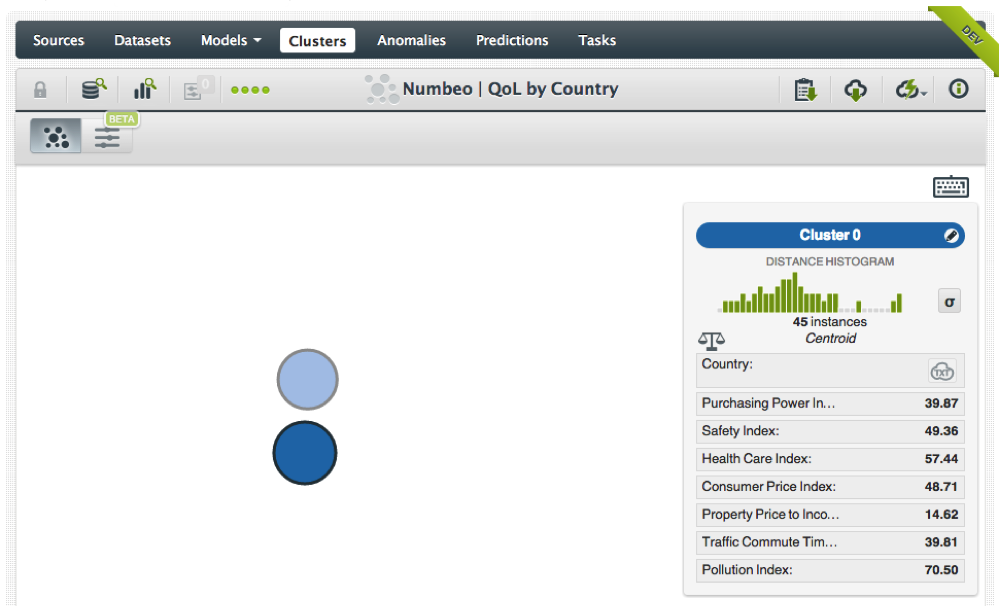
We used G-Means clustering with default settings to analyze all 86 records in the dataset. The process ended up with 2 clusters with 45 countries in Cluster 0 and 41 in Cluster 1 respectively — a pretty even split all in all. A quick gaze at the descriptive stats on the side panel shows that Cluster 1 tends to have a higher representation of wealthier, more developed nations, whereas Cluster 0 mainly consists of developing nations.
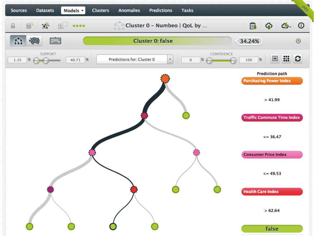
This is a great start, but what if you want to dive deeper into the make up of each cluster? Well, in that case, BigML already offers you the ability to build a separate decision tree model from each cluster as an option before or even after you create your clusters. As your clusters are created, so are the corresponding trees that you can traverse to better understand which variables better explain the grouping of instances in a given cluster.
For example, the screenshot below reveals that Purchasing Power Index had the most influence for Cluster 0, where any country with PPI less than 42 (the short right branch) was automatically classified as belonging to Cluster 0 among other more complex rules (shown on the more complex left branch).
Now, we have a better idea about the method behind our clusters. However, at times, we may need to dive even deeper into the data and see how individual records are laid out on a plane in relation to each other much like the cluster visualization itself, but applied to individual instances. This is especially useful if there are thousands or more data points to be analyzed.
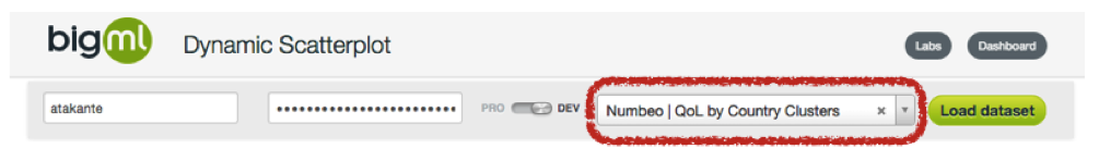
Our brand new Dynamic Scatterplot feature let’s you do just that. Once you navigate to the Dynamic Scatterplot screen, BigML asks you to specify which dataset it needs to use for plotting. As you type letters, matching datasets appear in the dropdown. After you select your dataset, you can pick the dimensions you would like to visualize. Up to 3 at a time is allowed between X and Y axes as well as the color coding.
The example image below depicts how each country in our Numbeo dataset is positioned according to Purchasing Power Index (X axis), Health Care Index (Y axis) and Cluster identifier (Color dimension). The familiar Data Inspector panel on the right hand side shows the values for a particular data point you can mouse over.
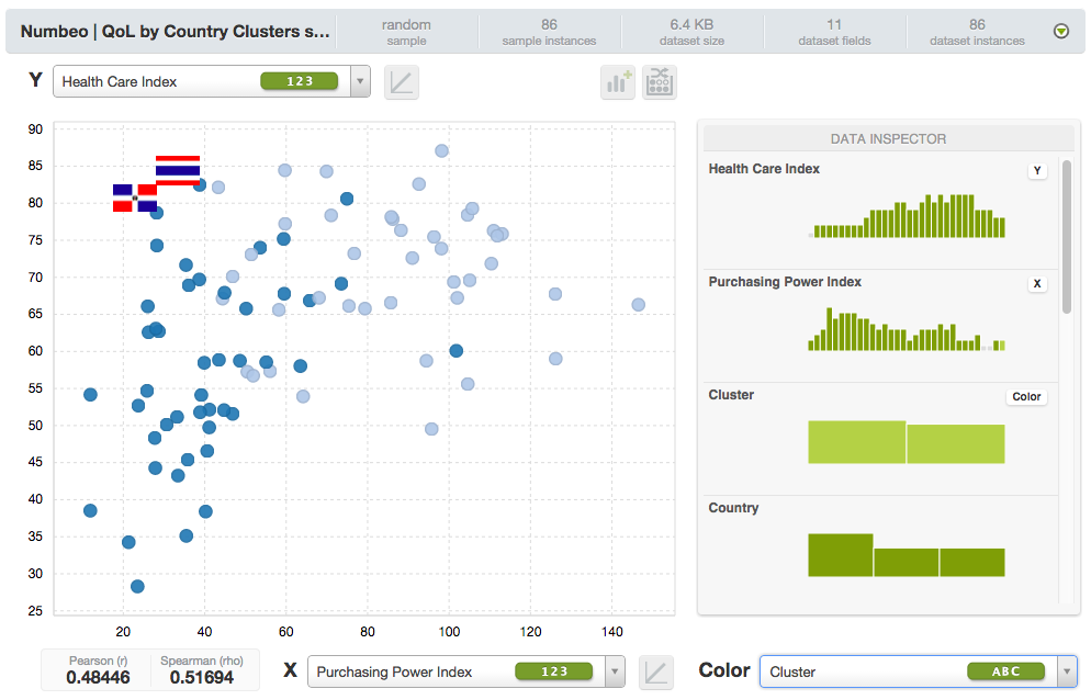
As you can see, even though our cluster analysis took into account all available fields, the dispersion in this visualization still shows a pretty obvious concentration of Cluster 0 (Dark blue) on the left bottom quadrant and Cluster 1 (Light blue) on the right top quadrant. This confirms our gut feel expectation that countries with higher purchasing power would also have higher quality healthcare.
However, there are interesting exceptions to note. For instance, the dark blue dot near the coordinate (40,80) is Thailand. (Please note that we have manually superimposed relevant country flags on the actual output.) Thailand is a developing nation. Nevertheless, it is punching much above its weight in terms of health care services. A little research reveals that there is a growing healthcare tourism industry in Bangkok drawing many foreigners seeking more affordable care. Similarly, Dominican Republic is also presents us with an interesting case.
We then get curious about the group of dots that have relatively high purchasing power (PPI>=80), yet not as high a healthcare score (HCI<=60) as one would expect at that level of purchasing power. The zoom in feature of Dynamic Scatterplots comes in handy for this. Marking the aforementioned area with our mouse we can instantly visualize just that portion of our chart as follows. (Please note that we have manually superimposed relevant country flags on the actual output.)
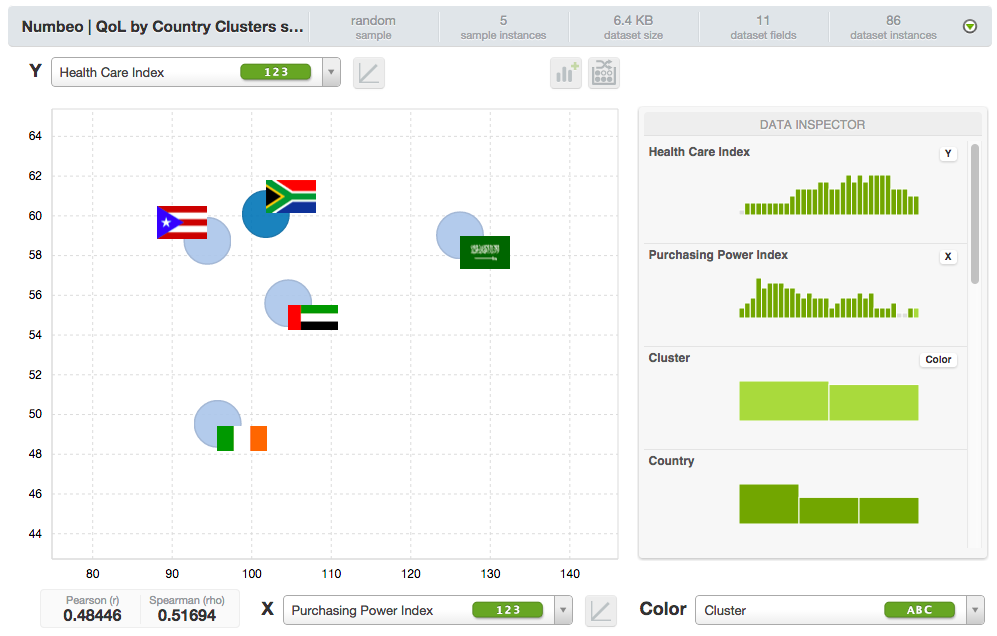
The 4 light blue (Cluster 1) dots here represent Puerto Rico, United Arab Emirates, Saudi Arabia and Ireland. These turn out to be wealthier nations with subpar healthcare.
As seen in this straightforward example, playing with the Dynamic Scatterplot is both easy and very teaching at the same time. One cannot always find easy explanations when utilizing Machine Learning techniques, but effective visualizations can help provide additional “color” and confidence to our findings, where other methods may fail.
We hope that you will give a try to this cool new offering from BigML as part of your next data mining project. As always, please let us know how we can improve it further. The best part is, it comes FREE with all existing subscription levels, so have at it!
