Last week Andrew Fisher posted on the Guardian’s Data Blog his analysis of the waiting lists for London council housing. The post triggered my curiosity.
The post argues that while on average 1 in 10 Londoners are on a council housing waiting list, there are vast differences per borough. While the borough with the lowest % of people on the waiting list only counts 3.1% of it’s inhabitants, the highest climbs up to 43.6%! Why is there such a difference? Time to feed some additional data into the BigML engine and generate some predictive models to predict the percentage of people on the waiting list.
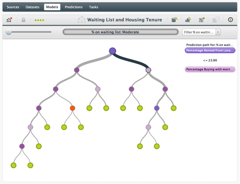
First I added data on housing tenure to the waiting list data. It shows what percentage of housing is rented out by the council, percent outright owned, percent owned through mortgage, etc. Here the first surprise struck me. Boroughs that have less than 24% of their housing in council housing have a moderate waiting list overall (5-10%). While the area’s that rent out a relatively larger portion of council housing have a high number of people on their waiting list. I would expect lower supply to lead to higher demand and therefor relatively more people on the waiting list. But the data points the opposite way. (Here’s a link to the first interactive model.)
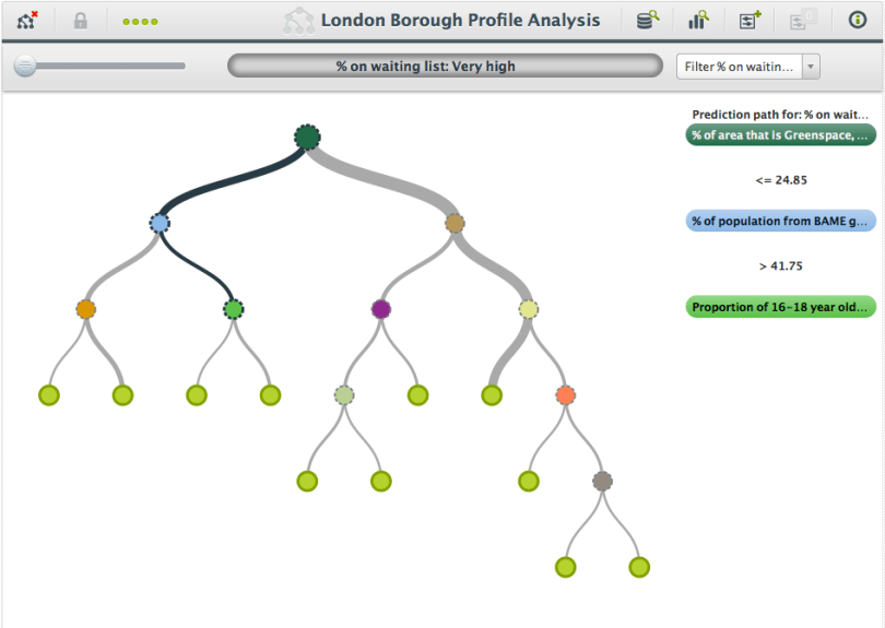
Let’s throw some more data at it. I found a profile per borough, containing a variety of demographic and geographic data. Out of the 60+ features that this profile has, the most discerning one for predicting the waiting list percentage is: The percentage of area that is Greenspace! Again, the outcomes are counterintuitive. If the Greenspace percentage is larger than 25%, the waiting lists are smaller and vice versa. Personally, I would expect that a nice, green living area attracts more potential renters and would therefore lead to larger waiting lists. (Here’s a link to the second model.)
In the branch that predicts high values, the next node is determined by the % of people from BAME groups (Black, Asian and Minority Ethnic groups). If that value is less than 41.75% the percentage of inhabitants on the waiting list for council housing is ‘high’ (10-15% of the population). If the value is higher than 41,75% the waiting list percentage is ‘very high’ (15-20% of the population).
On the other side of the tree, the next step is to determine the job density (Number of jobs/available work force). If the job density is lower than 0.52, the percentage of inhabitants on the waiting list for council housing is high (10-15%). If the job density is higher, the waiting list values drop to moderate (5-10%).
Because there are only 31 boroughs, going deeper down the tree is a bit treacherous because it leads to individual cases rather than an overall picture.
So what picture does this paint? This shows that area’s that have a lot of council housing are popular amongst the people applying for that type of housing. Specifically, a high presence of minorities leads to higher waiting lists, suggesting that ‘birds of a feather flock together’. The lower percentage waiting lists can be found in greener areas that have less council houses available. Greenspace, job density and percentage of people form BAME groups are the most important features of a borough’s profile to determine % people on the waiting list for council housing.
This analysis certainly doesn’t answer all questions but it does shed a different light on London’s council housing issues.


