BigML offers a chat support interface, where our users get their questions about our platform answered quickly. Recently, an academic user reached out explaining that he wanted to integrate our local model predictions with the explanation plots provided by the SHAP library. Fortunately, BigML models are white-box and can be downloaded to any environment to produce predictions there. This was totally doable with our Python bindings as is, but his question made us realize that some users might prefer a more streamlined path to handle the same scenario. So we just went ahead and built that, which is what this blog post covers in detail.

Understanding predictions
We know that creating a predictive model can be quite simple, especially if you use BigML. We also know that only certain models are simple enough to be interpretable as they are. Decision trees are a good example of that. They provide patterns expressed in the form of if-then conditions that involve combinations of the features in your dataset. Thanks to that, we can interpret how features impact what the prediction should be when computing the result, given their importance values. The feature contributions can be expressed as importance plots, like the ones available for models and predictions in the BigML‘s Dashboard.
However, as complexity increases, the relationship between the features provided as inputs in your dataset and the target (or objective) field can become quite obscure. Using game theory techniques, ML researchers have found a common-ground way to compute feature importances and their positive or negative contribution to the target field. Of course, I’m referring to SHAP (SHapley Additive exPlanations) values.
There’s plenty of information about SHAP values and their application to Machine Learning interpretability, so we’re going to assume that you’re familiar with the core concept and instead focus on how to use the technique on BigML‘s supervised models. The entire code for the examples used in this post can be found in the following jupyter notebook and you can find step-by-step descriptions there. Here, we’ll mainly highlight the integration bits so that you can quickly get the hang of it.
Regression explanations
We’ll start simple and do some pricing prediction using the California House Pricing file. It contains data about the medium price of houses in California and their features, like their age, the number of bedrooms or bathrooms, etc. In the notebook, the information is loaded in a Pandas DataFrame.
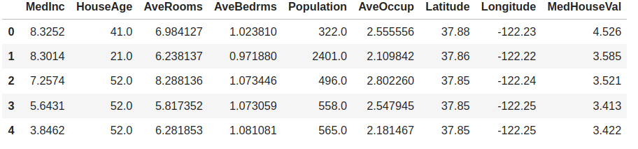
As you can see, the field that we want to predict is MedHouseVal, which happens to be the last column. BigML will use the last field in your dataset as objective field by default, so we can create a model from this data by uploading it to the platform, summarizing it and starting the training step. No special configuration is needed. We just need to create the corresponding source, dataset and model objects. Of course, we won’t forget to provide some credentials to authenticate first.
from bigml.api import BigML
# look for your credentials at (https://bigml.com/account/apikey)
USERNAME = "my_username" # use your own username
API_KEY = "my_api_key" # use your own API key
api = BigML(USERNAME, API_KEY)
source = api.create_source(train)
dataset = api.create_dataset(source)
model = api.create_model(dataset)
In this case, we created a simple Decision Tree model. BigML‘s API is asynchronous, so you need to check that the model is ready by using the api.ok method. If so it can be used for predictions. And that’s when you can start using the new ShapWrapper class too.
api.ok(model)
# The model is finally created and the model variable contains its JSON
# Now we create a wrapper to use it in the Shap library calls
from bigml.shapwrapper import ShapWrapper
shap_wrapper = ShapWrapper(model)
Indeed, that’s all you need! The shap_wrapper object provides a .predict method with the correct interface to create explanations using SHAP:
explainer = shap.Explainer(shap_wrapper.predict,
                           X_test,
                           algorithm='partition',
                           feature_names=shap_wrapper.x_headers)
shap_values = explainer(X_test)
The Explainer constructor expects a predictive function that will be applied to the Numpy array of inputs X_test. We also provide the feature names to be used in the explainer, that are available as the shap_wrapper.x_headers attribute.
Focusing on a particular prediction, we can easily use the SHAP library to quantify and plot the amount of positive or negative influence each of our features provided.
row_number = 2
shap.plots.waterfall(shap_values[row_number])

In this case, AveOccup has the highest contribution and causes the prediction to be higher than average while MedInc is the next most consequential feature, but has the opposite effect on the predicted value of the house.
Classification and categorical features
So far so good. The ShapWrapper class has provided a clean interface to use our model and that has been enough for SHAP to work. But what about classification tasks? For those, we’ll need to predict a category. Also, what if your data contains a categorical field? The SHAP library functions expect numeric Numpy arrays to be used as inputs and outputs, so we’ll need to do some encoding to express our categories as numeric codes.
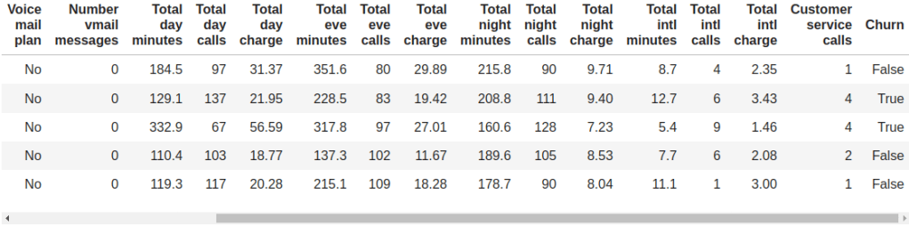
We’ve also improved our Python bindings to provide helpers for that case. Imagine we try to find explanations for a Churn prediction model. The data that we start from contains several features, some of which are categorical, and a categorical objective field (Churn) that is marked as “True” whenever the user churned from the service.
To build a classification model in BigML, you can use the same steps that we mentioned in the previous section: uploading and summarizing the data plus model training. The output is a white-box model that can be downloaded in a JSON format. Once the model is created, we can use the ShapWrapper class to interpret its JSON and provide the corresponding .predict method.
from bigml.shapwrapper import ShapWrapper
shap_wrapper = ShapWrapper(model)
In order to see the kind of fields that the model contains, we can use the Fields class. It provides several methods to manage and transform the fields information. In this case, it will be useful to know that it can be used to one-hot encode categorical fields.
from bigml.fields import Fields
fields = Fields(model)
print("Churn encoding: ", fields.one_hot_codes("Churn"))
In fact, that’s done internally when using the .to_numpy method to create the Numpy array from the corresponding DataFrame. Whenever the field is detected to be categorical, one-hot encoding is automatically applied.
X_test = fields.to_numpy(test.drop(columns=shap_wrapper.y_header))
explainer = shap.Explainer(shap_wrapper.predict,
X_test,
algorithm='partition',
feature_names=shap_wrapper.x_headers)
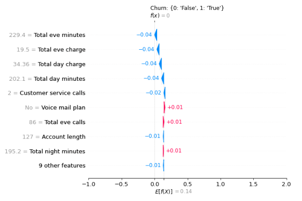
shap_values = explainer(X_test)And with some additional configuration of the underlying plot, we get to see the corresponding Shap waterfall representation for the first prediction in the test set given both the numeric and categorical inputs.
import matplotlib.pyplot as plt
y_categories = fields.one_hot_codes(shap_wrapper.y_header)
y_categories = dict(zip(y_categories.values(), y_categories.keys()))
plt.title("%s: %s" % (shap_wrapper.y_header, y_categories))
plt.xlim([-1, len(y_categories.keys())])
row_number = 0
example = dict(zip(shap_wrapper.x_headers, X_test[row_number]))
print("Predicting %s from %s" % (shap_wrapper.y_header, example))
shap.plots.waterfall(shap_values[row_number])
Explaining probability
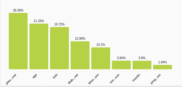
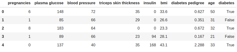
Finally, the SHAP library can also be used to plot the contribution of each feature to the prediction’s probability. Typically, this is represented using a force plot. The example that we’ll use here is the Diabetes dataset, where several tests and measurements are documented along with a diabetes diagnosis label at the end.
The steps to build a model are similar to the previous cases except we chose our model to be a logistic regression model.
model = api.create_logistic_regression(dataset)
api.ok(model)

from bigml.shapwrapper import ShapWrapper
shap_wrapper = ShapWrapper(model)
Instead of using the ShapWrapper.predict method, this time we’ll use the ShapWrapper.predict_proba method that will return the probabilities associated with each objective field class (‘True’ and ‘False’ in our case).
explainer = shap.KernelExplainer(shap_wrapper.predict_proba, X_train)
with warnings.catch_warnings():
    warnings.filterwarnings("ignore")
    shap_values = explainer.shap_values(input_array)
Once we have the probabilities computed, it’s quite simple to build a force plot
shap.force_plot(explainer.expected_value[1],
                shap_values[1],
                input_array,
                feature_names=shap_wrapper.x_headers)
In this case, the probability of being diabetic is predicted as 0.67 and the highest positive contribution to that value stems from the plasma glucose field.

Hopefully, these examples will help other users bring together the best of SHAP and BigML‘s Python bindings to better understand their models’ predictions. In the meantime, we’ll carry on and make Machine Learning easier for everyone!

One comment